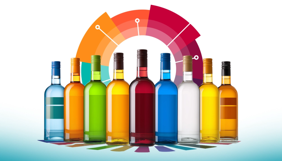
Have you ever walked into a liquor store, convinced you’d only grab a beer, and found yourself ogling a shiny bottle of vodka you’d never even heard of? And before you know it, you’ve grabbed the bottle. No judgment. You might not be alone or even fully in control of your decision. Something about that bottle just screamed, “Pick me!”. We’re all a lot more influenced by alcohol packaging color than we’d like to admit!
We did research in over 40 countries on the role of alcohol packaging color and got to know that it is more than just a finishing touch. It is playing some serious mind games with our alcohol buying decisions.
Let’s dive into a global survey of alcohol drinkers to uncover how alcohol packaging color plays a starring role in what ends up in your cart.
What Catches Your Eye First?
What is the first thing that grabs your attention when you have 30 seconds to decide what to buy for tonight’s party?
According to the survey, 34.3% of people worldwide say they’re drawn to the brand name first. Fair enough. Big names like Jack Daniel’s or Grey Goose have earned their street cred. 14.5% of folks admit that bottle or package color is the first thing that catches their eye. That’s right! Before price, before the fancy product description, that vibrant red or shimmering gold is whispering, “Hey, I’m the one you want.”
In places like Italy and Mexico, this number jumps even higher, with nearly 20% of drinkers saying alcohol packaging color is their first love.
Takeaway #1: Don’t feel guilty if a bottle’s bold hue pulls you in. Colors are designed to grab attention, and they’re damn good at it. What you can do is, when shopping, give yourself a moment to notice if the color is leading your consumer behavior or if the liquid inside is truly worth it.


The Psychology of Color
Some bottles feel like they belong in a penthouse suite while others scream “budget happy hour”. Right? It’s all about alcohol packaging color.
The survey reveals that 50.7% of people associate gold with premium alcohol perception. Black comes in second at 21.3%, giving off a sleek, mysterious vibe (hello, Johnnie Walker Black Label).

Why does this matter? Because colors tap into your brain’s shortcut for judging quality. Gold says, “I’m expensive, darling,” and your wallet might just agree before you even check the price tag. In fact, 26.8% of people globally admit to spending 15-30 seconds or more staring at packaging before deciding, giving those colors plenty of time to work their magic.
Takeaway #2: If you’re on a budget, double-check the price tag for those colors might be tricking you.

Do Colors Really Sway Your Choices? The Survey Says…
22.6% of people worldwide say they’ve chosen alcohol based solely on attractive packaging colors at least a few times. Another 9.7% confess to doing it “many times.” That’s nearly a third of drinkers who’ve fallen for a pretty bottle! That’s not just a passing glance. It is a conscious pull. Be it the vibrant green of a tequila bottle or the deep blue of a gin, colors nudge you toward a decision without you even realizing it.
Takeaway #3: So next time you are at a store, be aware of packaging influence. If you find yourself reaching for a bottle just because it looks cool, pause and ask: “Am I buying the booze or the vibe?” A quick reality check can save you from a pricey impulse buy.


How Long Do Colors Have to Work Their Charm?
26.2% of people spend less than 5 seconds looking at alcohol packaging color before deciding. That’s barely enough time to blink!
What does this mean? Alcohol packaging color has to work fast. Brands know they’ve got mere seconds to make you fall in love, so they pack their bottles with bold hues that scream, “I’m the one!”
Takeaway #4: If you’re a quick decider, train yourself to slow down just a tad. Give the brand attraction a second thought to ensure you’re not just falling for a colorful facade.

Wrapping It Up: The Colorful World of Booze
So, there you have it—alcohol packaging color is way more than just a pretty wrapper. It’s a psychological game, quietly shaping your alcohol purchase decisions with every gold, black, or red hue.
Next time you’re browsing the aisles, have a little fun with it. Spot that alcohol packaging color that’s calling your name and ask yourself: “Is this bottle really my type, or am I just falling for its colorful charm?” With 70.9% of drinkers admitting to some level of packaging influence, you’re in good company either way. So, sip smart, shop colorful, and enjoy the booze adventure!

1 Comment
Clemontina
11 months agoVery interesting to read that South Africans are hard to please. I, too, generally spend a long time reading labels and prices before making decisions. It’s sometimes easier and less time consuming when shopping online.